Thursday 20 December 2012
Wednesday 5 December 2012
Possible Collaborations
Now that this project is over I've been thinking about what I might possibly want to do for one of the open briefs where I set up my own proposal. I've been considering collaborating with both people in and outside of college for a character design and or audio based brief. These are the two areas I would say I'm most interested in and it would be silly not to follow that up because by doing so, it gives me a chance to improve and learn new skills. These are only initial thoughts for now and I'd like to perhaps do some work with the people I have in mind before setting up a full on project because I need to find out how well we work together and how they work because everyone is different and has their own ways of working.
Tuesday 4 December 2012
Recording Studio and Sound Effects
Today I quickly arranged some of the sounds we recorded in the sound booth to create a track for our level. All of the sound effects were done by us with exception to the crickets. I used Audacity to record and assemble the sound effects for everything. I had a lot of fun in the sound booth recording sound effects using our voices and any objects and things around us that we could get our hands on. One of my favourites would be the fire crackling we achieved by using the crisp packet. Sadly this won't be used as we don't have any torches in our finished environment.
Listening back to the track now, I'd definitely want to alter some sound levels because the monkey is obnoxiously loud and it should be part of the background in the depths of the jungle not at the foreground where it sounds like it's close by if not visible.
Overall I am pretty pleased with the general arrangement. There are a few sounds that overlap that sound s bit messy but I really like the subtle knocking sound and the clicking in the background. The bird sounds were fun to do and I had a listen to some bird calls before I decided to do them but they still aren't anything fancy.
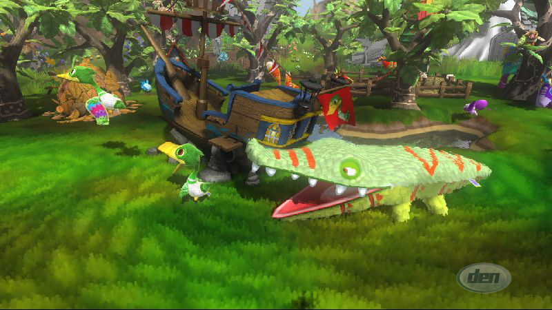
Finished Environment
I'm really pleased at how the finished environment has turned out. Considering it was split between two people I think we did a great job at putting the level together.

The overall look and layout of the level looks really good I think. It has a nice logical shape to it and more importantly follows that of Daryl's initial layout and ideas for the environment.
Although I did make the walls double sided when there's no need for it to be in terms of developing a game it has the potential to be turned into a maze or labyrinth in which the play can explore.


I really love how the textures were done, nice and simple which goes hand in hand with the toony graphic style we were aiming for. One of my favourite features are the texturing shadows. I would never have thought to ask if such a thing was possible and i think the dotted shadows really give that cartoony comic feel. It also adds a point of interest and helps to fill out the plain textures by adding a little dazzle to the scene.
Monday 3 December 2012
Animating
I had a lot of fun animating the characters but I got very frustrated with it for the most part. I found myself having to change and fix things such as the weight painting while I was animating which wasted a lot of time. Daryl came across a lot of problems during the rigging process anyway and had to repeat the process again and although we're all still learning I would have liked to have just got stuck into the animating rather than having to go back a few steps and fix things in order to do it. I think this will really slow down the process and I'm quite concerned because of the amount of time we have left.

Overall though I'm pretty happy with the walk cycles I managed to achieve despite the problems. For the Elder bird Adam had to change the geometry because the weight painting was so touchy and difficult to fix for the cape so in order to make some progress we scrapped the cape and I managed to animate him efficiently. I think perhaps the arm swinging animation could do with a bit of work because I got really confused at which point the arm starts to bend which really bugged me because the arms ended up looking really robotic without it. I think I'm alright with animating but I definitely need to observe body movement and use more references next time. It was also really hard to imagine how the characters were going to move so I gave them what I believe to be a generic walk sequence but I'd have liked to add a bit more personality in the walking especially with the age difference between the characters.


Overall though I'm pretty happy with the walk cycles I managed to achieve despite the problems. For the Elder bird Adam had to change the geometry because the weight painting was so touchy and difficult to fix for the cape so in order to make some progress we scrapped the cape and I managed to animate him efficiently. I think perhaps the arm swinging animation could do with a bit of work because I got really confused at which point the arm starts to bend which really bugged me because the arms ended up looking really robotic without it. I think I'm alright with animating but I definitely need to observe body movement and use more references next time. It was also really hard to imagine how the characters were going to move so I gave them what I believe to be a generic walk sequence but I'd have liked to add a bit more personality in the walking especially with the age difference between the characters.

Tuesday 27 November 2012
Envrionment: The Jungle
I first started off with by adding the trees I designed and then added boulders before I slowly filling that out by adding some of Adams foliage textures. Really happy with the outcome and it was a quicker job than I thought it would be which is good because I can now move onto animating.


Trees!
For the outside environment I first started in Unity using the terrain tools. I sculpted a nice terrain and created rocks and mountains to fill the place out a bit. I then looked up some textures and started adding layer after layer to get a nice detailed finish. It didn't really suit the graphic style we were aiming for though so I went through a long process of changing textures. I then came to the conclusion perhaps something more simple or just one texture on it's own would do the trick but the terrain itself wasn't doing it for me. So I decided to model the whole environment in Maya instead.
When moving onto designing the outside environment I first started thinking about trees. And I wanted a fairly simple model that has a lot of character like in the toon forest pack and I came up with this.


When moving onto designing the outside environment I first started thinking about trees. And I wanted a fairly simple model that has a lot of character like in the toon forest pack and I came up with this.

I enjoyed creating this tree design and I took a lot of inspiration from the toon forest pack which led me to looking at the textures in Viva Piñata. All the stripy textures for the grass on the toon forest pack instantly made me think of the Viva Piñata games and I never realised that adding little patterns makes all the difference. The grass in the game is nicely decorated with little leaf-like patterns and I think it looks beautiful and quite subtle due to the colours. The use of stripes in particular reminded me of football fields and I think the colours I went for are a more exaggerated version of that. I think perhaps the colours I've used are a bit too bright though? But it's hard to tell without the lighting and effects being added on to it in Unity. It might also look out of place when me and Adam combine the environments we've both been working on but they're easy changes to make.

Saturday 24 November 2012
Toon Forest Pack
So after handing over the basic environment to Adam to add assets to and fill out a bit more I drew my attention to designing the outside of the temple. I started looking around for cartoony trees and ended up stumbling upon this beautiful add on for Unity, the toon forest pack.

This pack and this style was perfect in my eyes and I would have liked to have bought it because getting add ons is a great way to help fill out environments and I might still come back to this idea in the future. In the end I didn't get it for the work we're doing at the moment because add ons are for the background only really not to decorate and cast them off as main assets. Because of that I decided it would be best to just model my own stuff and as part of the group I would also get ore credit for doing that. Plus, although this is a toon pack and I adore the style the texturing thus far for our own work is much more simple next to this so there would have been quite the dramatic contrast if I did decide to use it.

This pack and this style was perfect in my eyes and I would have liked to have bought it because getting add ons is a great way to help fill out environments and I might still come back to this idea in the future. In the end I didn't get it for the work we're doing at the moment because add ons are for the background only really not to decorate and cast them off as main assets. Because of that I decided it would be best to just model my own stuff and as part of the group I would also get ore credit for doing that. Plus, although this is a toon pack and I adore the style the texturing thus far for our own work is much more simple next to this so there would have been quite the dramatic contrast if I did decide to use it.
Problem Solving
So this is the UV map I did for the next character which I designed. From last time I learnt that I needed to make the UV shells on the texture editor a little bigger especially for things like the face, so that's what I did.


Again I really got stuck into this and enjoyed working around all the little nips and blips you come across. I got a little confused with the overlapping vertex points during the unfolding process for this but it's just a case of moving them around and finding out where the belong; following the lines to see what's connected to what and positioning them according to that. I did eventually come across something that I didn't know how to go about because the unwrapping shouldn't have been behaving like that. Even my tutor was stumped by it so it was just a matter of working around that. Because of little problems like that though, I thought the UV map looked quite messy this time around. I arranged everything again in a logical order but because of the problems there were a lot more individual pieces than I would have liked and it might come across as quite confusing when I hand it over to Adam. I explained everything and he said how it's arranged doesn't really matter as long as WE understand it but in industry I think that would be bad practice because the communication we had a group might not necessarily be there in a work environment.
Once again, very happy with my work and I've noticed that the more I do UV mapping the faster I'm getting and better I'm getting at spotting both problems and solutions. can't wait to see the textures being applied to this model in particular. Nothing beats seeing your creations come to life!
Thursday 22 November 2012
Sphinx and the Cursed Mummy
This is an old game I had for the PS2 and I thought because of the graphics style and the setting in Egypt that it would serve as a nice reference for colours and such for the environment.


I really like the idea of using different tones of the same colour for the brick work or the flooring. I think it add that little bit more interest instead of using just one flat colour. I think this is something we should follow up for sure because our texturing isn't really going to be detailed at all but it still needs to be attractive. The majority of the world in this game is all within the brown colour palette and despite how boring it sounds it works because of the environment it's set in. I think we'll be quite heavy with the neutral brown colours but we did want a really fresh vibrant environment for the outside and we wanted to dot foliage around the temple as well just to help break up the browns.


I really like the idea of using different tones of the same colour for the brick work or the flooring. I think it add that little bit more interest instead of using just one flat colour. I think this is something we should follow up for sure because our texturing isn't really going to be detailed at all but it still needs to be attractive. The majority of the world in this game is all within the brown colour palette and despite how boring it sounds it works because of the environment it's set in. I think we'll be quite heavy with the neutral brown colours but we did want a really fresh vibrant environment for the outside and we wanted to dot foliage around the temple as well just to help break up the browns.
Wednesday 21 November 2012
Thought Bubble Comic Convention 2012
So just like every year for the past 4-5 years I went to the Thought Bubble Comic Convention here in Leeds. I really didn't think I'd end up going this year but I decided that it would be in my better interest since a festival and or convention of some kind is now a compulsory part of my course. This is the main reason I attended really because I'm going through some financial problems and with every passing day, going to the Animex festival up in Tee-side is looking more and more slim. It's better to have a back up plan rather than not fufil the requirements at all.
All the educational stuff aside I really enjoyed the convention again this year. It's a great atmosphere to be around people who are all coming together to celebrate the thing we love. I wasn't going to cosplay but decided to go for it because you get cheaper tickets. Anything to save them pennies!
As usual there were a lot of the same artists around but it was refreshing to see new artists getting out there and selling themselves as a brand and getting recognition from the public and from the industry in a way because they're selling works next to professionals. I remember when I was selling stuff at one of the stalls back in 2010 and it's the best way to get networking with the professionals. This is definitely something I want to do again because I'd love to get feedback on my work.
This nicely leads me onto the fact that I regret not bringing a portfolio of my college work to get feedback on. I wasn't really expecting to go to the convention because I didn't know whether I could afford it or not and because of this, I was rushed didn't have time to put some work together. I'm hoping that after this exhibition we're having in.. December I think it was, that I'll have something more professional to show because the work so far isn't really at a standard in which I'd want to show it off. Presenting my work in different and more professional ways is something I will definitely work on as the years go by.
Sunday 18 November 2012
Environment WIP
So after deciding on a wall design I started to put together a corridor using the bevelled cubes and different wall patterns I created to reach a design I was happy with. As you can see I also created a dome at the bottom and roughly made the stairs to the altar and added a few columns where I saw fit.

Me and Daryl were in constant contact when I was modelling the environment and he explained some ideas he had for the dome room that he didn't necessarily add to the blocked out environment. He explained his ideas on having balconies and different floors and hanging foliage and such and me and Adam agreed that it was a really nice concept that we'd try add. So I sculpted out the different tiers for the dome and this is what I ended up with.

When I reached this stage, I had some more uv mapping to do so me and Adam passed around our work and he then started to add new environment assets and started texturing.
Friday 16 November 2012
Chris Green
Chris Green is a second year student at Norwich University and studies Game Art and Design. His modelling abilities are at a really professional level and the texturing and attention to detail is impeccable. He uses a mix of programs the main ones being Maya, Cry Engine, Z Brush 4, Photoshop, and some personalised packages and add-ons. Here is just a few bits of his work some of which I referenced for the corridor design.

This is a great example of his attention to detail. The scratchy textures on the rock and the cracks and chips in the block look so real. It almost looks like a photograph and it's truly inspiring. I'd really love to get to a level in which my work couldn't be noticed if I put it into a real environment. For a future project I really wanted to try out something like this. It's definitely a great idea for portfolio work I think, to create a simple asset but kit it out to a professional standard. All the small details count and can be the difference between a good and great envrionment.

This is a level design Chris did using the unreal engine. All the assets, the lighting and the small details like the foliage hanging from the trees and the tree roots have been executed so well. I'd like to say it looks real and it does but I think there that sense of perfectness about it especially in the brick works. But overall it's a beautiful piece of work and it serves as a great reference for our group project. Although there's a huge difference in terms of graphic style the different plants and the idea of adding statues might come in handy.

This is one of the pieces I referenced while making the temple corridor. The geometry for this is really sharp and flat and the textures are quite subtle which I like. I think for the graphic style we're aiming for as a group though the textures and stuff will be a lot more simplified than this but despite that, really grateful to find another student working on the Aztec/Mayan environment. It's been really useful as a visual aid.
Temple Walls
Daryl had blocked out the environment for me in Maya so we could get an idea of space and layout. This was then forwarded to me and I took that and started modelling. First I started off with the long corridor our characters will walk through which will open out into a big dome. I looked up some different brick arrangements for walls and tried various different combinations.


My main source of inspiration for the brick work were these images here. One of them was done by an Environment Artist called Chris Green and the other I couldn't find an artist for. I'll definitely make a post about Chris Green but for now back to my work. I specifically looked up Aztec Mayan style walls and these models popped up. I really liked the idea of having different sized bricks because it adds a little something and the opportunity to have a little bit of fun the texturing is there. For these images in particular the texturing is nice and simple, yet detailed and the models themselves look quite sharp. I really love the little engravings of images and squiggles in the walls, it adds a really nice touch. This is something I might attempt doing but at the moment I'm quite happy with the bricks alone. The different sizes keeps the wall from looking dull and it's simple yet effective I think.

The design I think I'm going to go with is the second one from the left. It has more variation and I think too many of the big bricks or too many of the small bricks looks like too much and I think this design has a good balance.


My main source of inspiration for the brick work were these images here. One of them was done by an Environment Artist called Chris Green and the other I couldn't find an artist for. I'll definitely make a post about Chris Green but for now back to my work. I specifically looked up Aztec Mayan style walls and these models popped up. I really liked the idea of having different sized bricks because it adds a little something and the opportunity to have a little bit of fun the texturing is there. For these images in particular the texturing is nice and simple, yet detailed and the models themselves look quite sharp. I really love the little engravings of images and squiggles in the walls, it adds a really nice touch. This is something I might attempt doing but at the moment I'm quite happy with the bricks alone. The different sizes keeps the wall from looking dull and it's simple yet effective I think.

Wednesday 14 November 2012
UV Mapping = Therapeutic
So after volunteering to do UV mapping for the group project I've found myself really enjoying it. The first time we were introduced to UV mapping I found it unbelievably hard but after doing it now I don't understand how that was so. I find myself really getting immersed into it and I won't leave it until it's done and I can do it a lot faster than I first anticipated too.


I had a lot of fun unwrapping this character because the clothes and body are all one piece of geometry so there was a lot of problem solving that had to be done.
I tried to arrange it in a logical order but when I handed it over to Adam he rearranged a few things because textures were getting stretched and such because the UV shells for some parts of the character weren't big enough. This is something I will definitely keep in mind for the next character.
I tried to arrange it in a logical order but when I handed it over to Adam he rearranged a few things because textures were getting stretched and such because the UV shells for some parts of the character weren't big enough. This is something I will definitely keep in mind for the next character.
Thursday 25 October 2012
Opportunities

So for part of my course it's now compulsory to go to a festival inrelation to what we do. I really like the idea that they're giving us a push to explore and take part in festivals that celebrate game, film and animation ut the problem for me is just money. Most of the big festivals I know of are abroad and I can't afford to do that and I found that looking for something on the same level but within the UK kinda difficult. There is an anual comic convention in Leeds but personally I don't think that it fully meets the brief so to speak. I can see potential in the fact that I can get feedback at the convention and even networking opportunities but I guess i'm craving for more than that.
So prior to that a friend kindly forwarded the Animex festival in Teeside at the University. I'm really interested in going because I have the feeling the lineup for the game section of the festival will be really good after looking at some of the workshops they have early on. There are people with really good backgrounds from working with companies like Disney, Dreamworks, Pixar, Valve, Spicy Horse anda whole range of other things. Ken Wong who is the art director for Alice Madness Returns is doing a workshop and his work is amazing! There's also some other cool work shops that really be useful like storyboarding and storytelling.
All in all I really hope I can make it to the Animex Game festival but the tickets are very limited so there's gong to be a huge burst of people buying them at the same time when they're officially released because the festival isn't until next February.
Sunday 21 October 2012
Patterns and Colours
So for my character design I also researched some colours and patterns to help with clothing designs and the general colour scheme for my character.


I really liked all the different zig-zag patterns and the colours on all of them are beautiful. Because we're going for toony graphics bright bold colours were definitely the key I think and I picked on the the colours which came up most often and put them together to create the colour scheme for the girl. I think using the sandy cream colour as the base of the clothing would work really well to bring out that tribal theme and it also creates a great canvas to add more contrasting colours.
Friday 19 October 2012
'Young Bird' Design
So, we're now creating bird characters and came up with an interesting concept. when chicks are born they're essentially naked and we thought we'd put a spin on this and make the younger character more human and as she matured she'd get more bird-like features or 'earn her feathers' so to speak. And with this in mind I started to create my character.


The bird features I decided to give to her were the beak, legs, feet and arms. I did contemplate giving her wings but as she's only a little 'chick' I decided to experiment with clothing to imitate different features instead. The poncho worked well to resemble wings I thought and I also looked at pumpkin pants because they have a nice balloon shape to them. I thought it was a nice way of achieving those feathery pants you see on chickens for example.

As you can probably tell these pictures aren't digital. I decided to use my well loved pro markers to get nice flat colours for my drawings. I used these pens a lot when I'm working on colours for character designs because they're simple and I feel more at home doing traditional drawings rather than digital.
Thursday 18 October 2012
Fashion Influences
Here's a quick mood board I made of the kind of things I really liked when I did a bit of research into everything from tribal clothing to accessories.

The kind of things I wanted to pick out were things that have or look like bird features such as drapes, sleeves, tassels and lots of dangling accessories.
Because of the tribal theme I really like the idea of props especially a mask. All the masks on here are all based on birds but the one that stands out for me is the one in the middle. Such a great use of basic shapes and simple paint designs yet it still clearly resembles a bird with the long beak in the middle.
Tuesday 16 October 2012
Wind Waker Inspirations
Being a big Zelda fan the pure mention of a bird tribe made me think of the Rito from Zelda Windwaker and by looking at my character you can tell a lot of her design was inspired by this. I really love the way that they incorporated the use of wings and sleeves which is why I want to experiment with different kinds of clothing that could help resemble some of her features.

The toony style of Windwaker is something I believe we're aiming for as well so I'd also like to explore light, bold colours together with a simple design. The toon shader effect is also something I'd like to try out for our environment because it might help amplify and enhance that graphic style we're after as a group. I think we'll have to experiment with textures a little but. We have decided we want to hand make all our textures with Photoshop but the level of detail we go into might differ depending on how it turns out.

The toony style of Windwaker is something I believe we're aiming for as well so I'd also like to explore light, bold colours together with a simple design. The toon shader effect is also something I'd like to try out for our environment because it might help amplify and enhance that graphic style we're after as a group. I think we'll have to experiment with textures a little but. We have decided we want to hand make all our textures with Photoshop but the level of detail we go into might differ depending on how it turns out.

Monday 15 October 2012
Back to Basics
To start off with, we started looking at bird people from myth and legends and even the prehistoric times. We mainly looked at Greek sirens, harpies, angels, and one of our peers suggested looking up Tengu. All these subjects are part human and part bird and since that was the direction we were heading especially for the character I've decided to create, this was the best place for us to start.

It's been really useful to see the different shapes and sizes and especially to have a reference for the anatomy. I'm sure little things like this will come in handy for the skeleton while doing the rigging process.

It's been really useful to see the different shapes and sizes and especially to have a reference for the anatomy. I'm sure little things like this will come in handy for the skeleton while doing the rigging process.
Sunday 14 October 2012
Roots of Inspiration
The games that we looked at were Windwaker, Psychonaughts, Spyro and Rayman. Adam really took a shine to the enemy designs on Rayman 3 and I think there might be some inspired features on his character in relation to this. Even the environment is so full of life and personality in the Rayman games from 2D to 3D. The same applies to the Spyro games. Although I can't say I've played any of the recent games, Spyro has always showcased beautifully colourful worlds and has introduces some great characters from all shapes and sizes. This is another thing I'm sure we'll take into consideration when designing the assets for the environment and for the texturing/colours.
.png)


.png)


Error. Originality Lost.
For the group project we wanted to contribute where we could however we did still distribute roles between us. For the concept art, me and Adam chose to be in charge of a character each and Daryl had the environment.
The idea we settled with was for the Stolen theme and we were going for an 'Indiana Jones take the relic' idea. So naturally, we went for a cliché confident and self loving character who is out to impress a girl who he stumbled across in the wilderness. Despite all this, the new 'Jungle Jane' was reluctant to co-operate and was quite a grumpy little thing. Stranded out in the jungle they come across a temple and this is where our animation begins.
The character I decided to design was the male lead in the story and here he is...
[insert picture here]
After presenting out ideas to our peers, I kept getting lots of comments about my character looking like Flynn Rider from Tangled. After that the more I looked at him the more that frustrated me because I couldn't unsee it and for me, there was a loss of originality. Another comment that was made was about Adam's idea to have bird characters being quite an interesting route to take and we were given some suggestions in terms of research revolving around that idea. After this we went away and thought again about our characters and we all agreed that the humans just didn't have that edge and decided to return to the bird idea because it got a better reception and would be more fun and challenging.
Tuesday 2 October 2012
What I've done over the Summer
In honesty, I haven’t really done much productive stuff over the Summer Holidays due to family affairs.
BUT…
After sometime things eventually started to cool off and I managed to squeeze in some doodling time.

This is one of my old— in fact probably my very first OC (original character) called Setrian a.k.a Syon. He is a very handsome young prince who enjoys breaking the rules. He’s very cheeky and has quite the fowl mouth on him for royalty. I haven’t developed his story in quite some years now but, in a nutshell, he lost his parents and the kingdom at a young age and worked as a mercenary for some time before finding a new home at an academy. This academy basically brings together people like himself and opens new doors and opportunities to help start a new chapter in their lives. Since coming to the academy lots of different events took place. He made new friends as well as enemies, he’s fallen in love and is now a father and the list goes on.
Man this is harder than I thought! But you kinda get the gist of things. Now down to the more technical elements~
My drawing style is quite unrefined and all over the place. I'm still trying to find a style that I'm happy with and reflects ‘me’. I've been out of practice with drawing for quite some time now and college concept art based work is really been a struggle for me because of this. I am still trying to get back into it and hopefully I'll be able to spit out some good work in the future.
My strengths seem to be pointing to traditional methods from pencil and paper to the use of pro markers and copics. I do have a wacom tablet but I can;t say I've produced any nice pictures with it yet. I also need to explore a little more with different software to find something I'm comfortable with. At the moment Paint tool SAI seems to be my preferred program.
Overall just need to keep at it in order to improve. As they say, practice makes perfect.
Sunday 30 September 2012
Don't be too quick to judge!
Okay so I've just stumbled upon a really nice piece of animation for My Little Pony made by Feedsy. What I love most about this video are the transitions. The transitions are very creative, full of life and most of all, incredibly smooth.
The animation and visuals were created using a blend of both After Effects and Photoshop from the new Adobe CS6. I've yet to try out the new versions myself but I'm very excited to mess around with the new feature and to see how much of a difference the Adobe Mercury Graphics Engine makes.
Anyways, back to the animation~
It was inspired by 'Vanishing Point' which was made by Motions Graphic Designer Takuya Hosogane. This video was another big hit with me and I can see why it was fuel for such inspiration. The fluent movements and actions in response to the music is flawless.
Overall, I really love this piece~ Quite simple graphic wise with nice fluid movement, not to mention the ticklish music! Gotta love it! It somewhat reminded me of Takashi Murakami's work, specifically the advertisement he made for Luis Vuitton. I think it was the combination of colours, music and pacing of the animation that brought about my comparison, particularly the similarity of the music.
Subscribe to:
Posts (Atom)